Beyond the Bar Part II: Three Alternatives for Visualizing Comparisons
Bar charts are a common visualization for comparing categories of a variable or comparing values between different variables. Bar charts are not bad graphics. But let's face it, using too many bar charts in a visualization makes for a dull display. In this post, I share three alternatives to the tried-and-true bar chart that pack a powerful punch.
The Data:
The data used in this post are from a 2020 report detailing the perspectives of art museum directors (p. 32). The specific question the data are drawn from asks:
When making decisions about which artwork to acquire at your museum, which of the following do you prioritize? (Select all that apply.) Respondents could select all that apply from the following list:
Artist Identity (e.g., Jewish, Islamic, Christian, Buddhist, etc.)
Time Period (e.g., contemporary, romanticism, medieval)
Region (e.g., European, Southeast Asian, African)
Medium (e.g., paintings, prints, sculptures)
Religion (e.g., Jewish, Islamic, Christian, Buddhist, etc.)
The Original Design: Horizontal Bar Chart
Option 1: Lollipop Chart
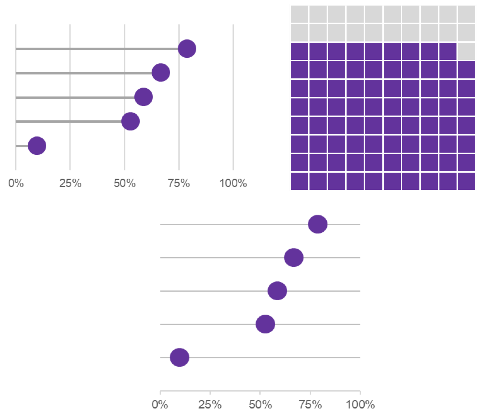
Up first is the lollipop chart. Lollipop charts are a cross between a bar chart and scatter plot. While a bar chart plots values using (horizontal or vertical) bars, in a lollipop chart, the bars are replaced by lines with dots at the end. The resulting image closely resembles a lollipop.
Option 2: Cleveland Dot Plot
The Cleveland dot plot is yet another option. Like lollipop charts, Cleveland dot plots use filled in circles (or dots) instead of a bar to plot values. Where they differ is that Cleveland dot plots do not have a line that extends to the axis.
Option 3: Waffle Chart
A final choice is the waffle chart. A waffle chart is a grid of 100 squares with each square representing 1% of the total 100%. The number of squares that are highlighted on the chart is determined by the data you wish you present.
So, the next time you need to show comparisons between different variables or two or more categories, try one of these new designs instead.
Which option(s) do you prefer? Are there any you are excited to try? Let me know in the comments.


