
Visualizing Data with Data Bars
Excel spreadsheets can hold an overwhelming amount of data. However, data tables are not particularly helpful when you want to make quick comparisons or uncover data patterns. Data bars are a powerful yet underused built-in Excel feature for visualizing data. These within-cell bar graphs allow you to apply conditional formatting to a cell (or range of cells) to visually compare values in your worksheet.
Recently, I was perusing the Pennsylvania Department of Education’s website for data, and I came across the Pennsylvania System of School Assessment (PSSA) RESULTS web page. (The PSSA is a standardized assessment used in the state of Pennsylvania and measures student achievement in four subject areas: reading, mathematics, science, and writing.) I exported school-level data on the percentage of third-grade children who performed below basic, basic, proficient, or advanced on the English/Language Arts section of the PSSA in 2016 to an Excel Workbook. I was curious as to whether the percentage of students scoring in each performance category (i.e., below basic, basic, proficient, or at advanced) varied between schools in Pennsylvania. To explore this question, I applied data bar formatting to my worksheet.
To create data bars, first, highlight the cells you wish to visualize. Next, click on the Home tab’s Conditional Formatting icon, point to Data Bars, and select More Rules.

After selecting More Rules, the New Formatting Rule dialog box should appear. The dialog box displays several settings that can be used to format the selected cells and create data bars. Given that percentages in my data table are displayed in the general number format, the following settings needed to be specified:
Rule Type: Format all cells based on their values;
Format Style: data bar;
The minimum and maximum values to 0 and 100, respectively; and
The cell type to Number.
Once I made these modifications, I clicked OK. (You can also change the color and fill type (i.e., gradient fill vs. solid fill) of the data bars if you so choose. You might even decide to apply the Show Bar Only setting so that cell values will not be visible once the worksheet is populated with data bars.)

Using the preset Bar Appearance settings will populate the selected cells with solid blue data bars.

Now, you can visually analyze the percentage of third-grade students who performed below basic, basic, proficient, or advanced on the English/Language Arts section of the PSSA in 2016 at each school.
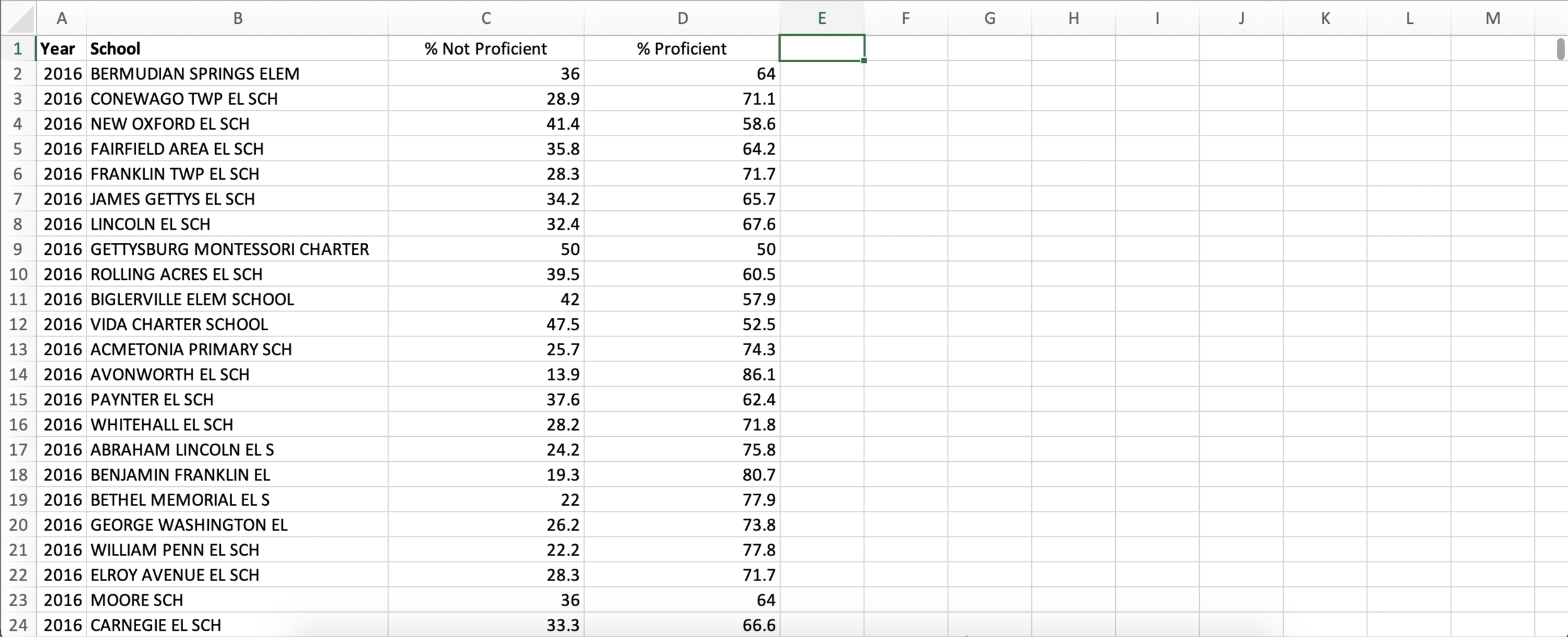
While visualizing different levels of performance is informative, it does not enhance our ability to make comparisons between schools. So, to kick my data bar analysis up a notch, I collapsed the performance levels into two categories: % Not Proficient (i.e., sum of below basic and below) and % Proficient (i.e., sum of proficient and advanced). I then copy-pasted these cell values into a new worksheet.
To take full advantage of Excel’s data bar features, I applied data bar formatting to each column separately. First, I highlighted the column containing information on the percentage of third-grade students who were proficient or higher on the PSSA in 2016 (i.e., % Proficient), clicked on the Home tab’s Conditional Formatting icon, pointed to Data Bars and selected More Rules. The following settings were then specified in the New Formatting Rule dialog box:
Rule Type: Format all cells based on their values;
Format Style: data bar;
The minimum and maximum values to 0 and 100, respectively;
The cell type to Number;
Show Bar Only: Setting selected;
Bar Appearance Color: Turquoise; and
Bar Direction: Left-to-Right.
Finally, I clicked OK to apply the settings.

Using the same method as above, I applied data bars to the column containing information on the percentage of third-grade students who were not proficient on the English/Language Arts section of the PSSA in 2016. However, I made two modifications: 1) Set the Bar Appearance Color to Red; and 2) Set the Bar Direction to Right-to-Left.

The result (after some font formatting):

Now, you can (more) easily make comparisons between schools. The best part? You can use other built-in Excel features (like filtering) to examine the data further: