
Declutter Your Designs

I hate clutter. I don’t like it in my apartment. I don’t like it on my computer. I don’t even like it on my plate. So it should not come as a surprise that (visually) cluttered designs drive me crazy.
In this post, I’ll share the five-step process I used to take a design from cluttered and confusing to clear and visually compelling.
The Before:

STEP 1: Remove background color and the chart border.
These elements distract the reader from the data displayed in the chart.

STEP 2: Clean up the axes.
Each bar in the chart is labeled, so you can get away with only showing the minimum and maximum values on the y-axis. Remove the x-axis line and tick marks, they are visual clutter the reader has to process. The y-axis tick marks can be left as is; they help to frame the chart data

STEP 3: Chart labels should be horizontal (and uniform)
Vertical (or diagonal) text can be hard to read, so make sure that your chart labels are horizontal. During this step, I also decided to make the chart axes labels a little more appealing. I replaced the x-axis labels with the standard three-letter abbreviation for months of the year. I also ditched the clunky y-axis label and instead added the y-axis measurement units, millimeters (mm), to the axis scale. Finally, I rounded each data label to the nearest whole number and moved the data labels for the vertical bars in the chart to the “Inside End” position.

STEP 4: Customize chart colors.
Apply colors that will complement the overall look and feel of the visual or (if you’re lucky) that are specified in your organization’s style guide. I pulled the blue color from the organization’s logo. (You can use Microsoft’s color picker to match colors from a website, picture, or logo.) Other changes I made include:
Setting the chart font to Arial (this is the font used in the document containing the chart);
Making the chart data labels white and bold;
Setting the font color for the x and y-axis labels to a grey color; and
Applying a muted grey color to the y-axis line.

STEP 5: Reduce bar gap width
I set the “Gap Width” of each bar in the chart to 30%, so the data labels are clearly visible.

The Redesign: (after using (color) transparency to emphasize a key takeaway message, and adding an informative title and a callout):
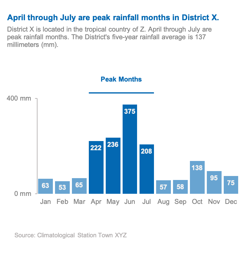
Data visualization design is about more than presenting a pretty picture; it’s about (visually) communicating information in a clear and compelling way—sans clutter.
Need one-on-one support creating effective charts that tell your data story? Get in Touch!