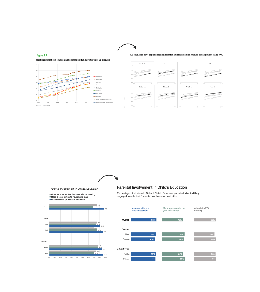
Simplify Your Comparisons Using Small Multiples
Visuals with an overwhelming number of categories are confusing to interpret. Simplify the chart into small multiples…

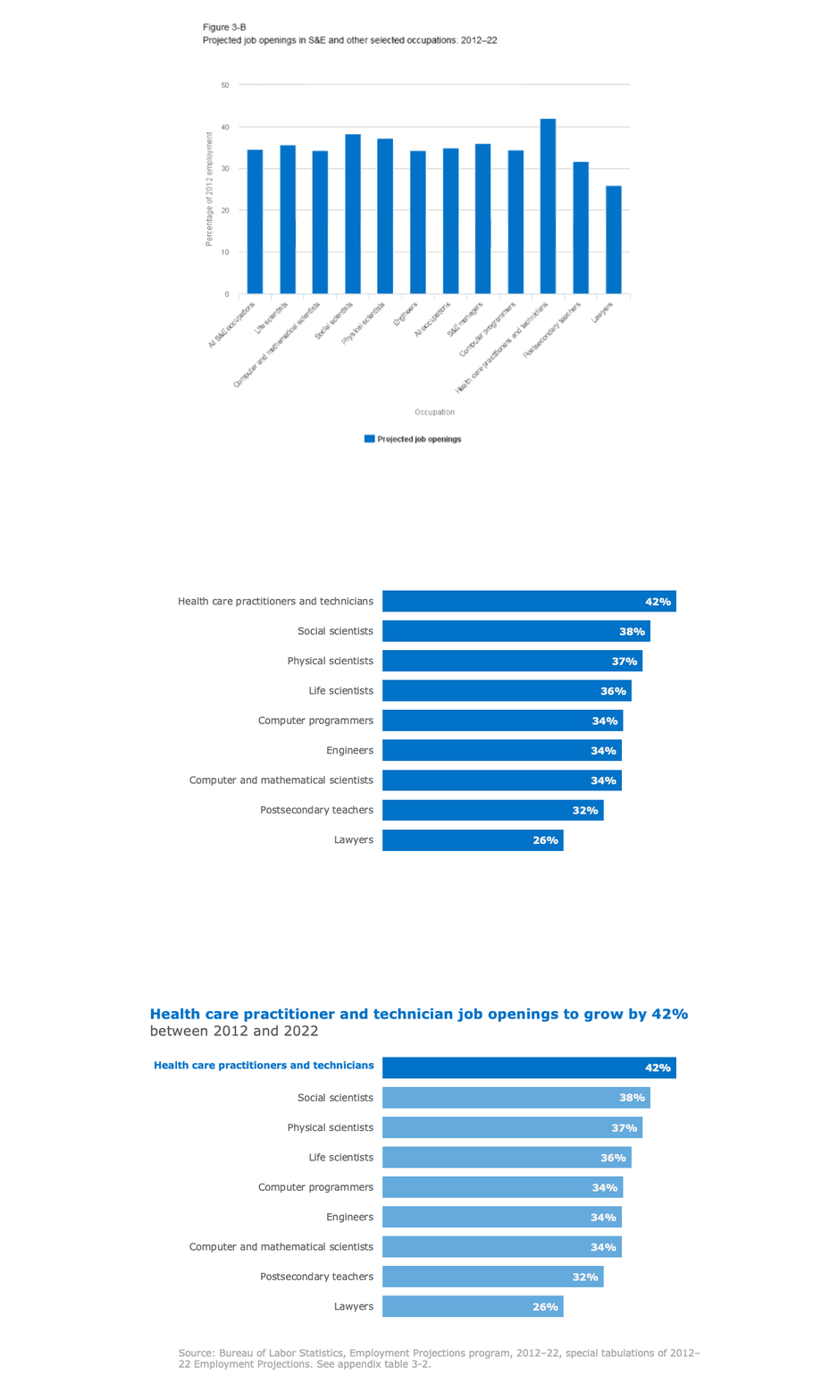
Sometimes it Pays to Swap Axes
A simple solution for a vertical bar chart with long category labels is to swap the x and y axes so that the labels are shown on the y-axis, and the data are displayed along the x-axis…

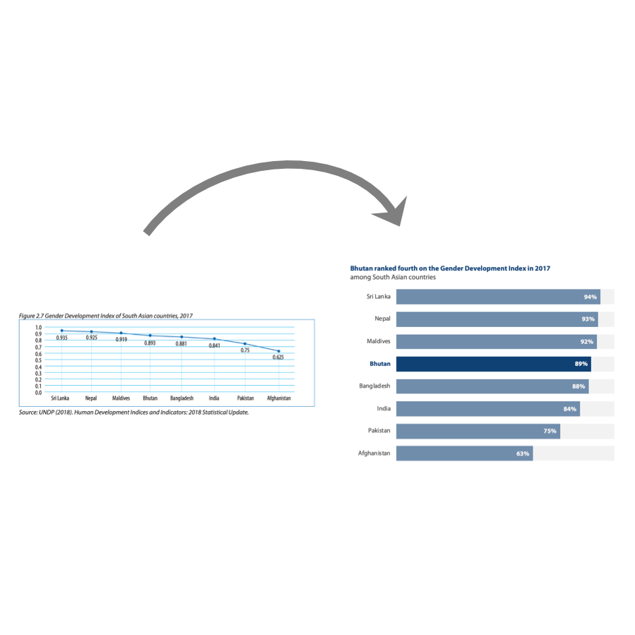
When NOT to Use a Line Chart
There are few hard-and-fast rules when it comes to data visualization, but one thing is for certain: line charts are not suitable for comparing multiple categories at one point in time for a single variable…

Think About (the Amount of) Ink
When designing a chart, use your ink wisely by: (1) Reducing axis clutter; (2) Bringing the chart information into focus; (3) Using color to highlight a key point; and (4) Adding an informative title…

When Graphs Get a Bad R.A.P.
When something about a chart's design seems off, check whether it follows the R(epetition) A(lignment) P(roximity) principles of design...

Use Contrast to Create Impact
Color contrast is a powerful way to direct attention to specific elements of a design and can make your message more memorable…
