
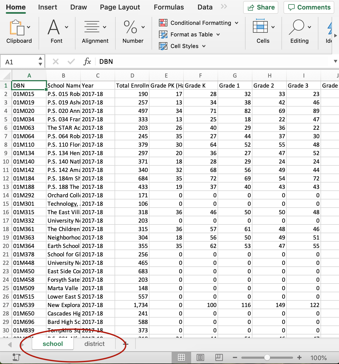
Parsing data into pieces
Merging data from different sources is easy to do when you have a common unique identifier…
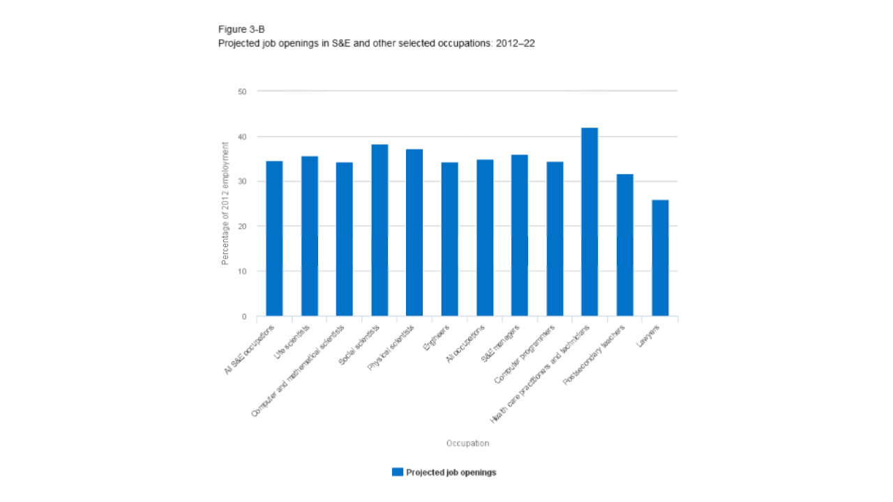
Sometimes it Pays to Swap Axes
A simple solution for a vertical bar chart with long category labels is to swap the x and y axes so that the labels are shown on the y-axis, and the data are displayed along the x-axis…
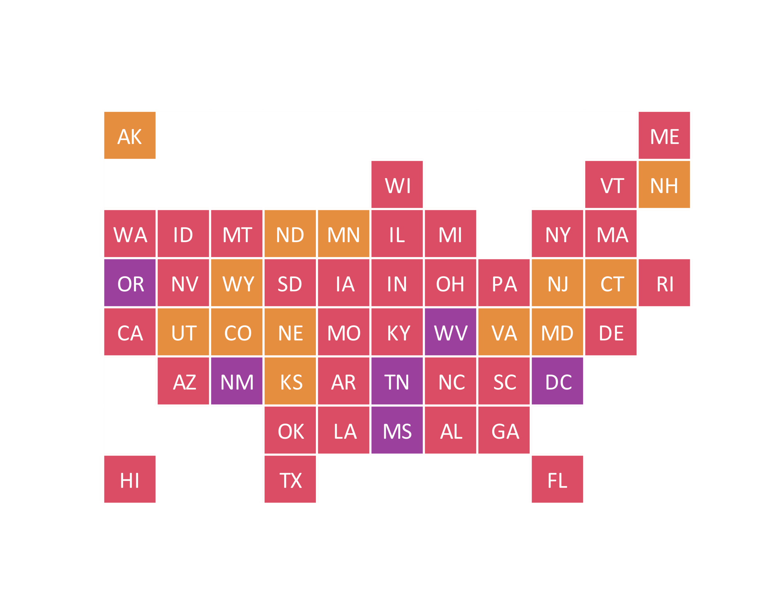
Data Viz Toolkit: Tale of the Tile Grid Map
Although choropleth maps are a common choice for visualizing data that are location specific, they can be difficult to interpret — especially when the areas on the map vary in size. This is where tile grid maps become useful…
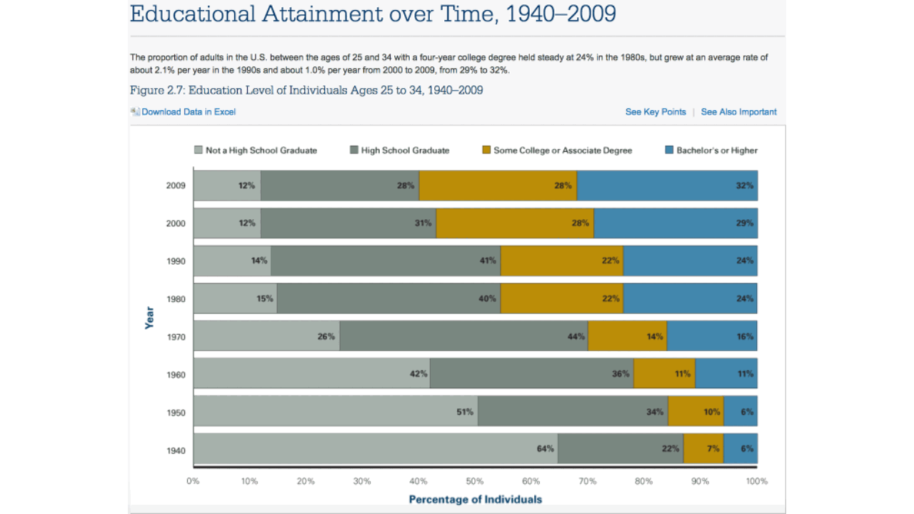
Making Meaning, Without the Mental Gymnastics
For a chart to be effective, it must convey a specific message. It is up to the designer of the visual to highlight the relevant information and craft a compelling story around the data…
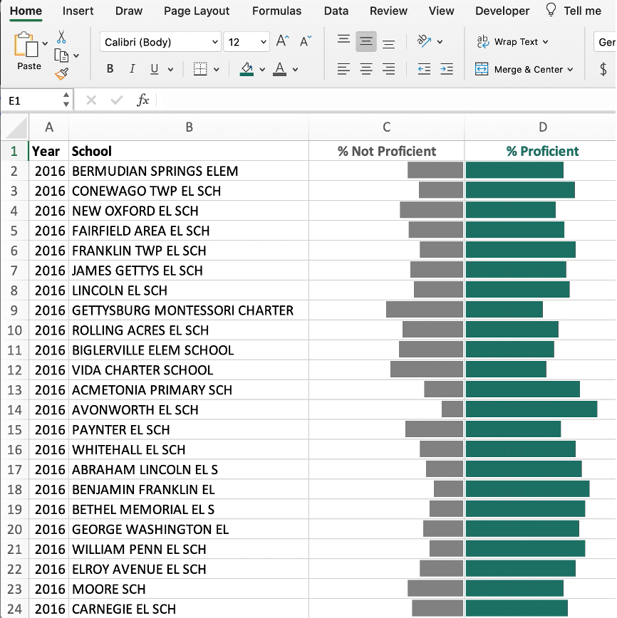
Visualizing Data with Data Bars
Data bars are a powerful yet underused built-in Excel feature for quickly visualizing large amounts of data…