
Declutter Your Designs
Data visualization design is about more than presenting a pretty picture; it’s about (visually) communicating information in a clear and compelling way—sans clutter…
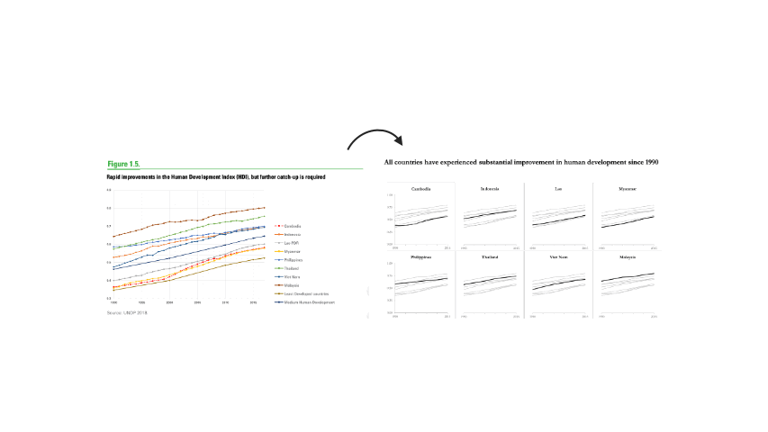
Simplify Your Comparisons Using Small Multiples
Visuals with an overwhelming number of categories are confusing to interpret. Simplify the chart into small multiples…
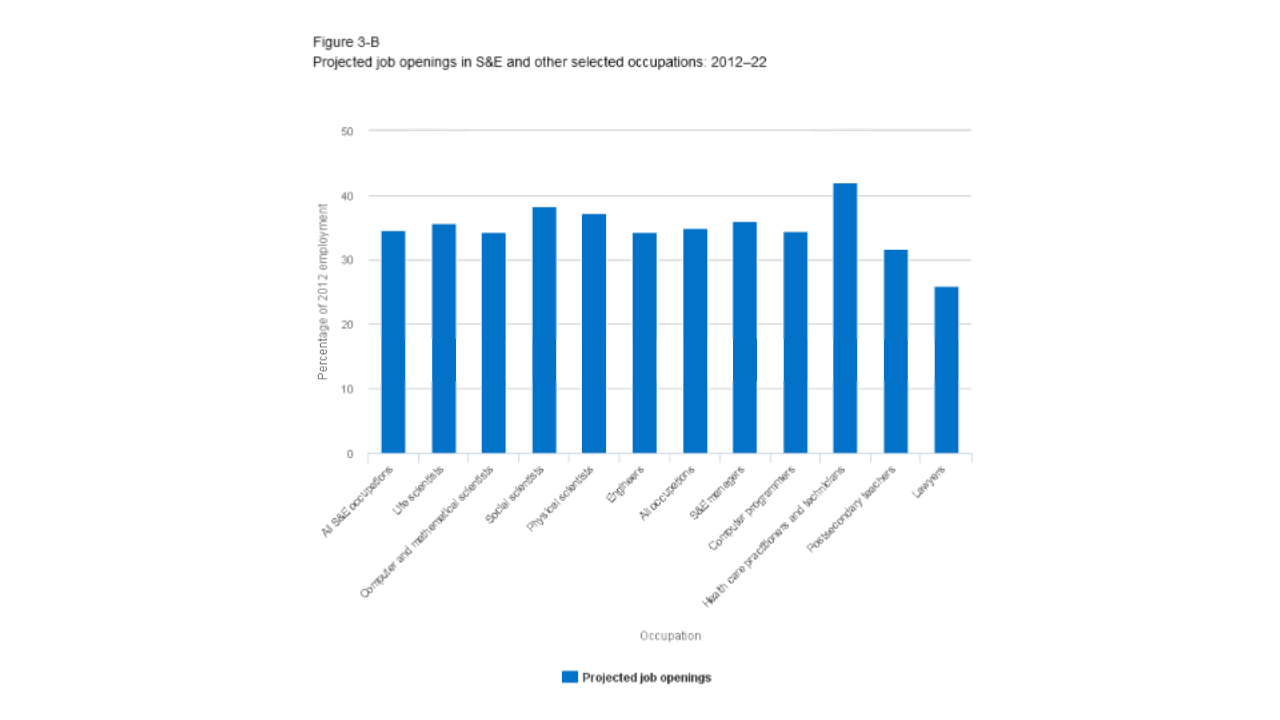
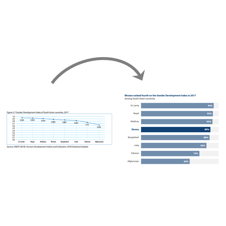
Sometimes it Pays to Swap Axes
A simple solution for a vertical bar chart with long category labels is to swap the x and y axes so that the labels are shown on the y-axis, and the data are displayed along the x-axis…
When NOT to Use a Line Chart
There are few hard-and-fast rules when it comes to data visualization, but one thing is for certain: line charts are not suitable for comparing multiple categories at one point in time for a single variable…

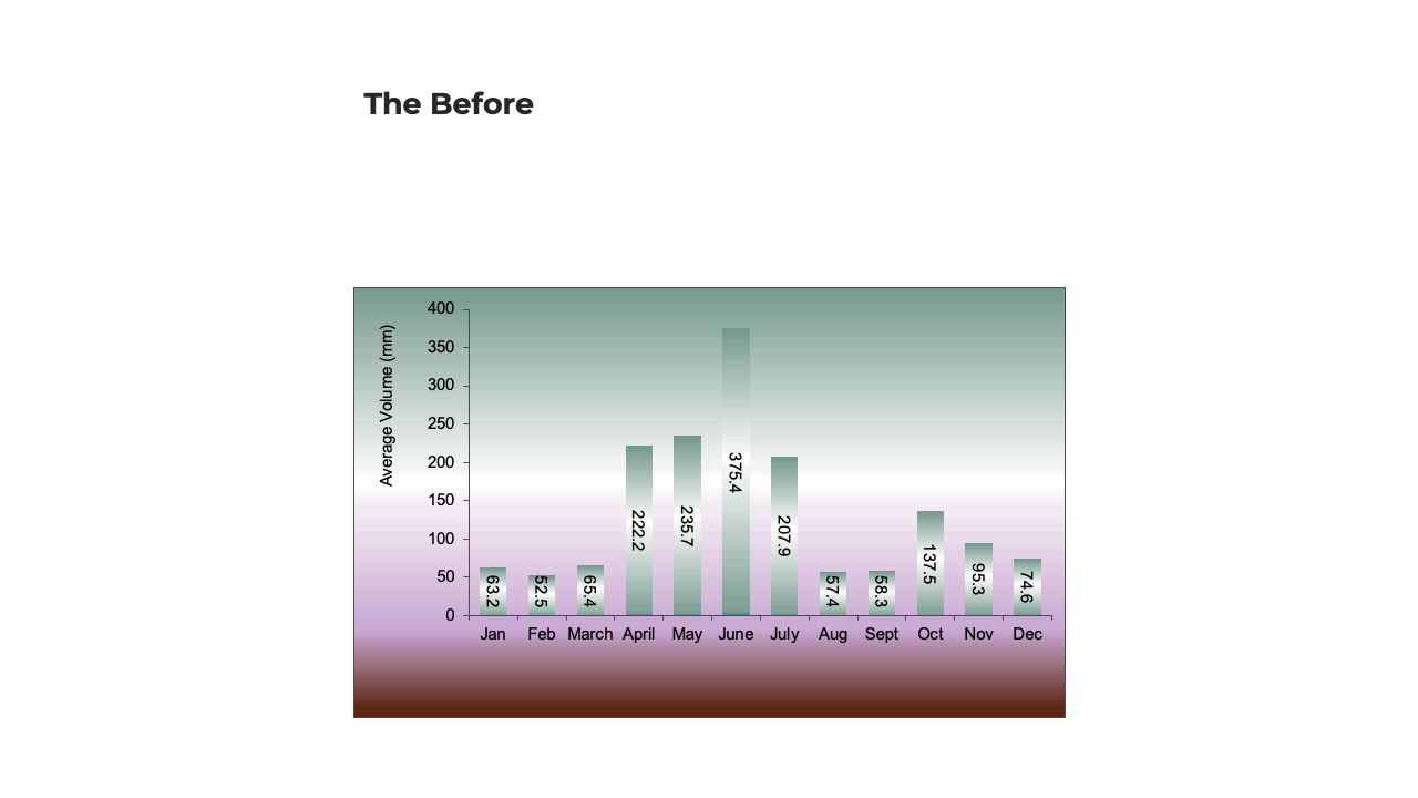
Think About (the Amount of) Ink
When designing a chart, use your ink wisely by: (1) Reducing axis clutter; (2) Bringing the chart information into focus; (3) Using color to highlight a key point; and (4) Adding an informative title…

When Graphs Get a Bad R.A.P.
When something about a chart's design seems off, check whether it follows the R(epetition) A(lignment) P(roximity) principles of design...